Overview
Keywords, impressions and clicks, oh my!
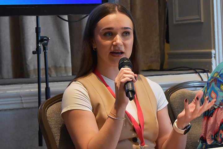
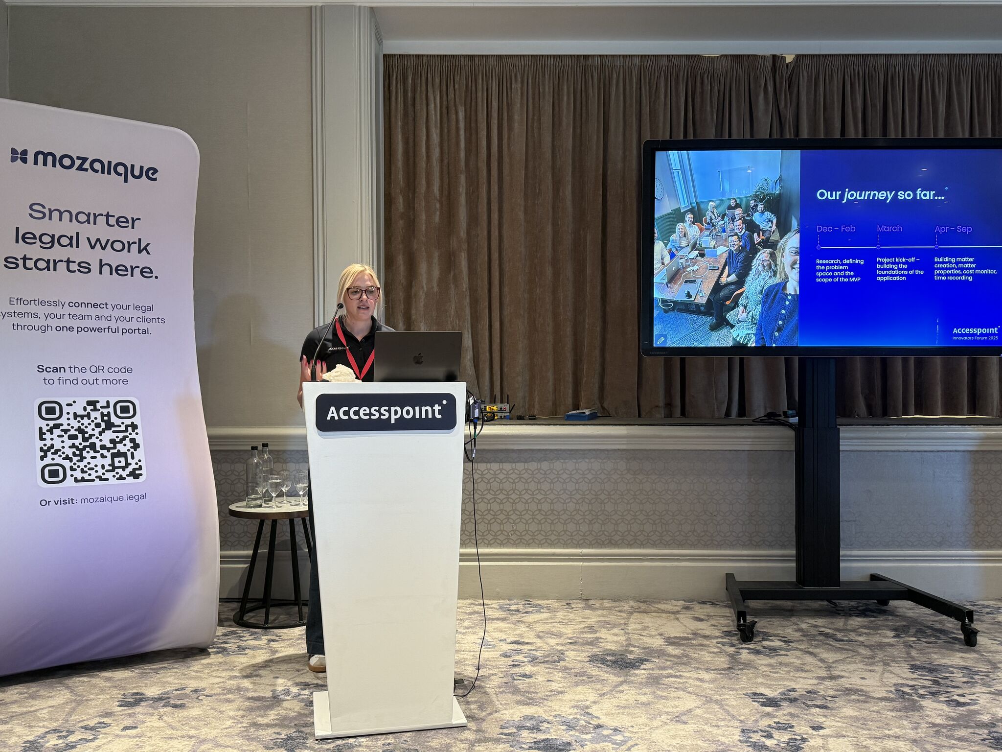
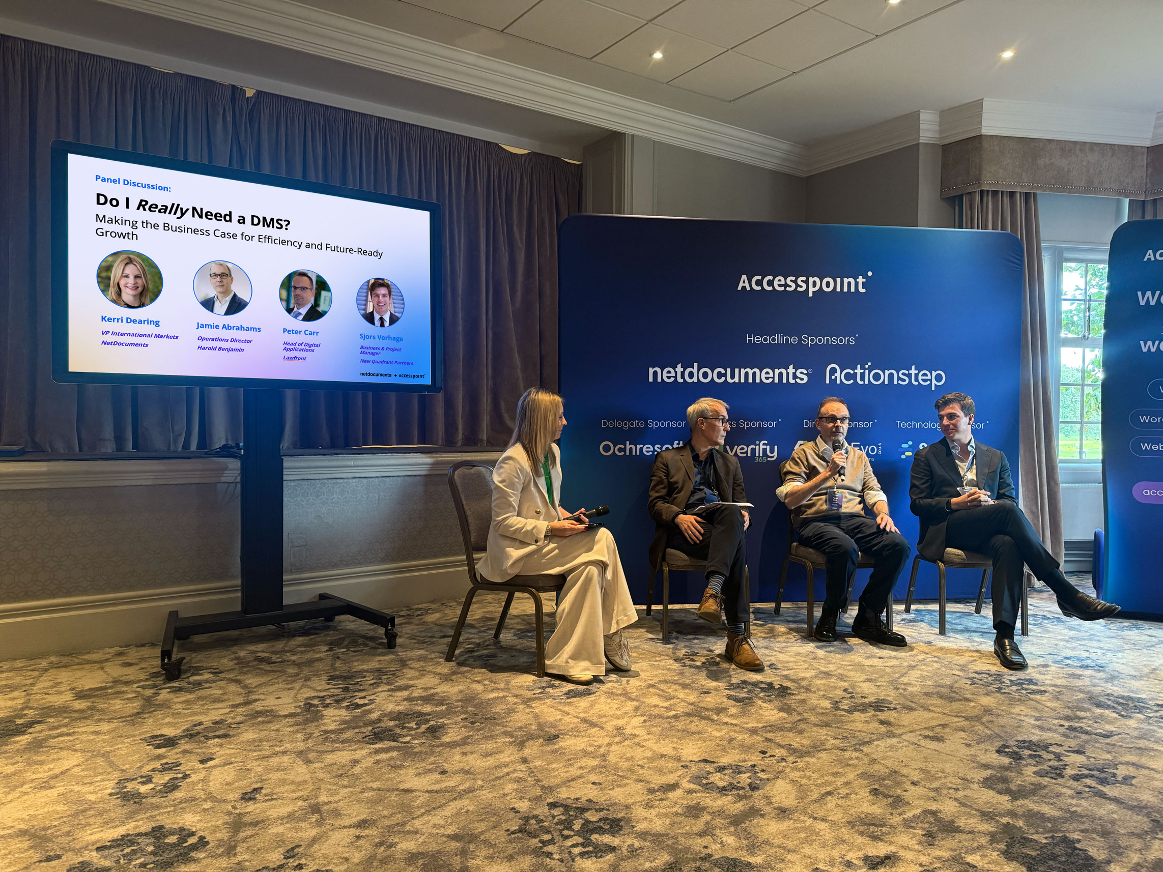
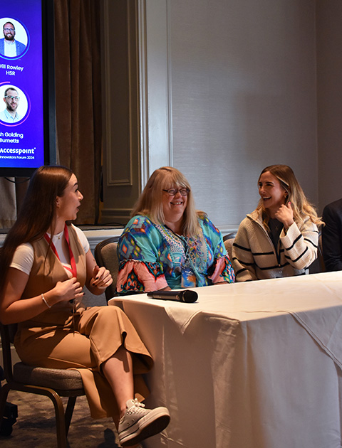
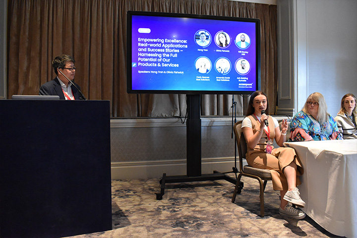
At this year’s Accesspoint Innovators Forum, we hosted our popular fire-side chat with clients from Best Solicitors, Burnetts and HSR Law Solicitors. Unfortunately due to unforeseen circumstances, Will Rowley (Practice Manager at HSR Law) couldn’t attend and so we placed Olivia on the panel to talk through the work she and Will have been doing together and the latest results from the new landing pages.
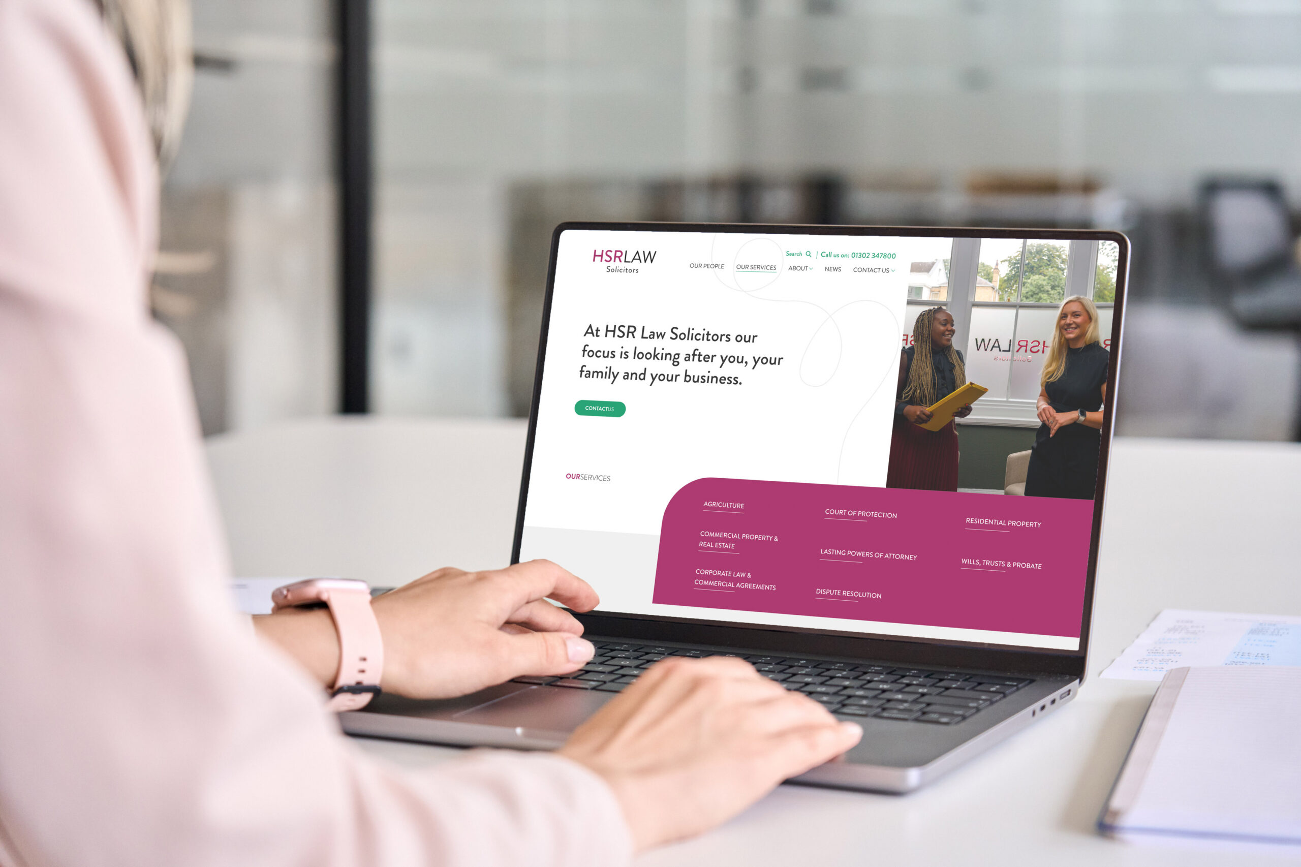
HSR instructed Accesspoint to create their new website last year. What did they want it to achieve?
Original objectives were quite simple: heavy focus on original imagery, not stock imagery. Improve and modernise the brand across the website and subsequently use this new branding to establish a strong social media presence with the strategy of driving all traffic back to the website. HSR also wanted to improve web enquiry forms to seamlessly link client submissions directly to their PCMS. We did all this through the launch and then with the digital marketing and SEO work we do, this allowed us to work through the objectives of a better social strategy and an increase of website traffic.
What kind of results did you see post-launch?
So within a month of launch the google impressions increased by 4000. Just to put into perspective, an impression is when somebody sees you on the Google Search Results Page (SERP). This isn’t a click. It’s a reflection of visibility and how often you are seen across Google. Contact form completions increased by 38% and we saw an 164% increase in organic users. Just to put this into perspective because I know percentages can sometimes be a bit ambiguous: In the 3 month period of June – August last year, HSR’s website generated 94,000 organic google impressions. In that same period this year, that hit 194,000. That’s a 100,000 increase. It’s massive what the new site and SEO work has done for them.
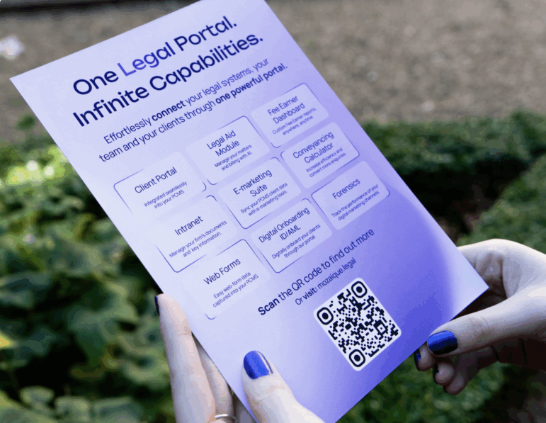
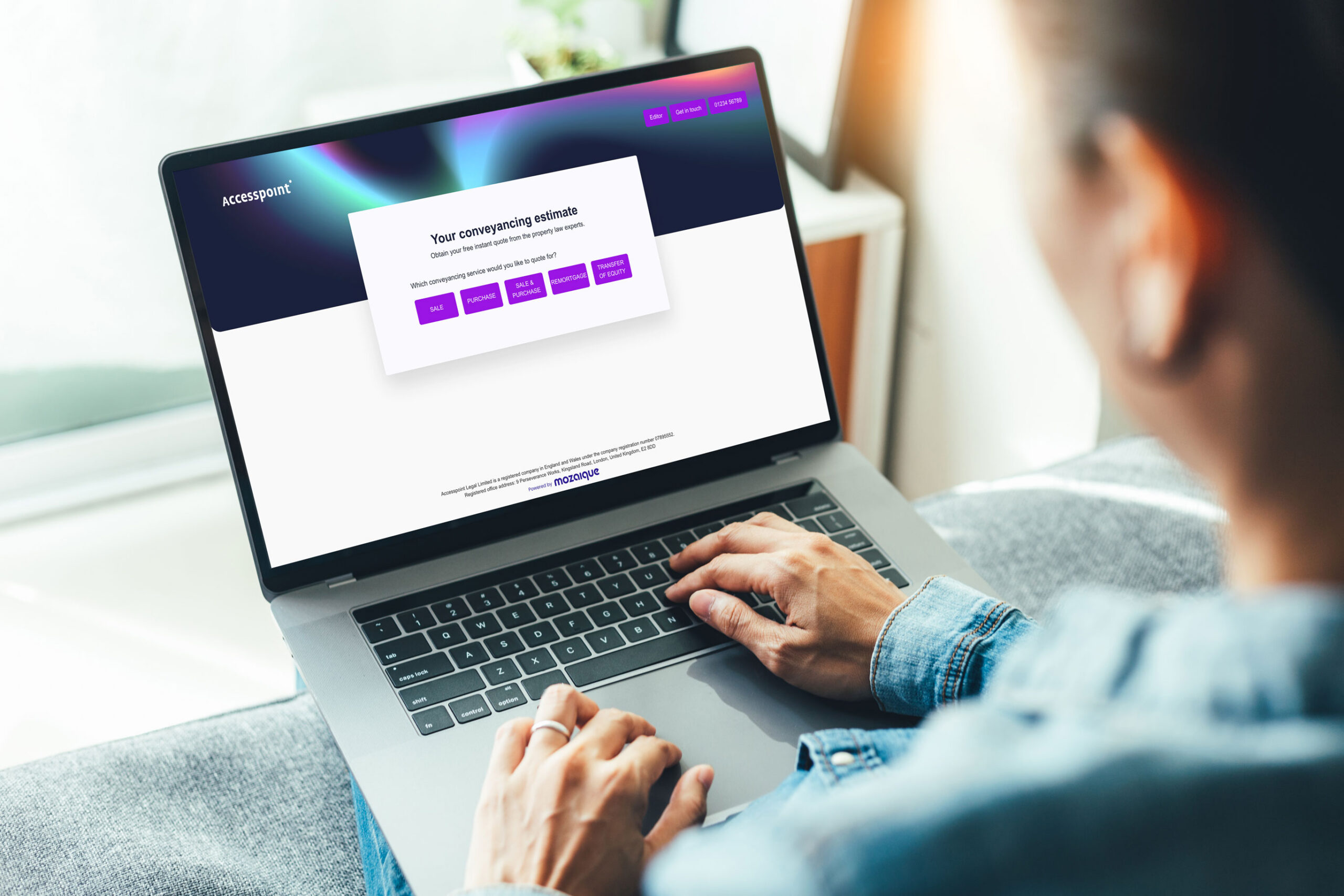
Will and the HSR team have recently implemented our Mozaique conveyancing tool, which he said was purely down to the success of the SEO work you’ve been doing with him. He said that the conveyancing team have seen such an uplift in new enquiries that they needed a more efficient process to deal with them, in order to cope! What did the SEO work entail to achieve this incredible result?
When HSR instructed us to create a new site with them last year and also signed up for an SEO and Digital Marketing contract, the first thing I said to Will is that your website is quite small and has so many opportunities to be bigger and increase visibility: more pages = more indexability on Google.
There wasn’t a lot of content, bar landing pages for the main services such as Residential, Probate, Agriculture, Commercial; with a bullet-pointed list of sub-services. I said to Will the first thing we need to do is set up monthly meetings and identify the different departments to target and expand on the site. In February after Wills & Probate focus, we focused on Residential. We went from 1 residential page on the site to 1 parent and 12 children pages for all the sub-services, and then worked on FAQs and adding relevant accreditations such as CQS to the pages. We now have 8 number 1 positions on Google for residential property key-terms and 13 in the top 3. Some of these being auction solicitors, buy-to-let solicitors, right-to-buy, new build, transfer of equity – you can see how much visibility on google we’ve achieved from simply focusing on expanding content and optimising it for the search engine. Without those pages, we’d be missing out on all those keyword opportunities. And Will said in our last call how ridiculously busy the online enquiries are for residential now, which in turn contributed toward the decision in the conveyancing tool.
Olivia, one final question for you from someone who’s a proper layman, when it comes to marketing (ie. me). I hear a lot of my clients say, Ok, yes we need a new web site. Ours is looking old or the law firm next door has a nice new one and we don’t want to look less snazzy than them! But from the point of view of someone who actually helps firms to utilise the website, capitalise on the additional traffic, to ultimately generate more revenue: What actually makes a good website?
Firstly, it needs to be modern. Does it look like it belongs in 2024? And is your imagery strong? People do shop with their eyes and the first impression when they land on your website is absolutely vital.
You also need to check if your website is quick. You can test it on Google’s Speed Test. Because a slow website infuriates customers and all they’ll do is get rage-clicks, feel annoyed and consequently leave your site; seeking out a competitor. We want to keep your customers happy and provide them with a good experience which encourages them to stay. This leads me into the navigation: can you find what you’re looking for on your site? The menu needs to be simple and easy to navigate through, or again, you’ll see a high bounce rate and lack of engagement.
Lastly, your website needs to have consistent call-to-actions (CTAs). We like to design our CTAs in a different colour (usually a secondary colour) so that it stands out against the primary colour palette used across the website branding. Click-to-call and bespoke contact forms should be strategically placed around your site so that visitors can easily convert at any point in their journey. This for me is the foundation of a great website.
In terms of capitalising off it, our dev team then have the skills to create cool integrations such as web enquiries seamlessly landing in your PCMS as a lead, and more. We also create all our websites bespoke and custom-built, using WordPress, so that it removes the costly intervention of third-party agencies who create the back-end of their websites so that you have to pay every time you want something changing. We remove all of that. WordPress is flexible and easy to use, and you’ll be able to figure it out with no cost involved.
